Continuous improvement is a strategic approach that focuses on enhancing processes, products, and services incrementally over time to achieve operational excellence. Let’s understand the tools, process, importance of it.
What is Continuous Improvement?
Continuous improvement is a strategic approach that focuses on achieving operational excellence by systematically enhancing processes, products, and services.
This philosophy involves making incremental improvements over time rather than through one-off major changes. The underlying belief is that there is always room for improvement, regardless of how well a process or system currently performs.
Continuous improvement is essential to provide quality products and services to customers. It is known as the Kaizen approach in Japan.
Total Quality-oriented organizations continuously improve their processes, products, and services, as well as their people through training. They are improving day by day, month by month, over years and even decades. It is the cumulative effect of hundreds or thousands of small improvements that creates dramatic changes in performance.
Through continuous improvement, an organization can easily change the process, culture, and behavior within the organization. All of the Quality Awards demand continuous improvement in all processes.
Tools For Continuous Improvement
Continuous improvement is an essential strategy for achieving operational excellence, and leveraging the right tools is crucial for its successful implementation.
Among the most effective tools for continuous improvement are benchmarking, control charts, Pareto diagrams, run charts, fishbone diagrams (Ishikawa diagrams), check sheets, histograms, and flow charts.
Benchmarking serves as the cornerstone, allowing organizations to compare their processes and performance against industry leaders to identify areas for enhancement. It involves a structured three-phase process: preparation, execution, and post-execution, ensuring a comprehensive approach to improvement.
Control charts are instrumental in monitoring process stability over time, distinguishing between normal and abnormal variations.
Pareto diagrams, based on the Pareto principle, help focus efforts on the ‘vital few’ causes that contribute to the majority of problems, facilitating efficient problem-solving. Run charts offer a simple way to visualize data trends over time, enhancing understanding of process performance.
Fishbone diagrams provide a systematic method for root cause analysis, identifying the underlying factors contributing to process variations. Check sheets enable structured data collection, which is essential for subsequent analysis.
Histograms visualize data distribution, aiding in the assessment of process variability. Lastly, flow charts depict process steps, highlighting inefficiencies and areas for improvement.
Collectively, these tools form a robust framework for organizations committed to continuous improvement, driving enhancements in quality, efficiency, and customer satisfaction.
- Benchmarking
- Control Chart
- Pareto Diagram
- Run Chart
- Fishbone Diagram/Ishikawa Diagram
- Check Sheet
- Histogram (Frequency Distribution)
- Flowchart
Benchmarking

An organization committed to quality must supplement its performance with benchmarking to compare its functions with similar functions in other organizations. This process ensures that the organization continuously improves and can meet customers’ requirements accordingly.
Benchmarking is the process of understanding one’s practice and performance, comparing them against competitors or best-in-class firms, learning how they practice and perform, and using that information to improve one’s practice and performance.
It is an effective mechanism for change and a valuable tool for continuous improvement.
Benchmarking can fuel creativity and provide a stimulus that enables operations to understand better how they should serve their customers. To conduct benchmarking, firms should know their situation and identify what and who to benchmark.
To use benchmarking effectively, the firm should have sufficient information from its competitors or best-in-class organizations. Thus, benchmarking can be conducted.
According to Hun, benchmarking is the process of:
- figuring out what to benchmark,
- finding out what the benchmark is;
- determining how it is achieved, and
- deciding to make changes or improvements in one’s own organization’s practices to meet or exceed the benchmark.
“Benchmarking can be accomplished by looking for companies that may be carrying out a function extremely well, no matter what their size.” This may mean examining:
- Internal operations,
- competitor’s procedures,
- methods used by other companies that are carrying out the same function in different industries”.
Control Chart
It is essential to understand the trend or performance of a process. In order to track the trends or performance of a process, you can construct a line graph, often called a control chart.
A control chart is a statistical tool that helps managers distinguish between in-control processes and out-of-control processes. It is a useful graphical tool for monitoring the activities of an ongoing process. Operating data are collected from an ongoing process and plotted on a graph.
Control limits shown in the graph provide a range for normal operations. A control chart has a central line, a lower control limit, and an upper control limit. All of these are calculated from information about the sampling distribution.
From a glance at the graph, you can see whether operations in the process are within the control limits.
The vertical axis of a control chart represents the units of measurement used in monitoring performance. The horizontal axis represents the time interval for taking measurements. Control limits are estimated by determining the mean and standard deviation.
Generally, the upper control limit is the mean plus 3 standard deviations, and the lower control limit is the mean minus 3 standard deviations. After entering the data points on the chart, you need to draw a line connecting the data points. Below is a specimen of a control chart.
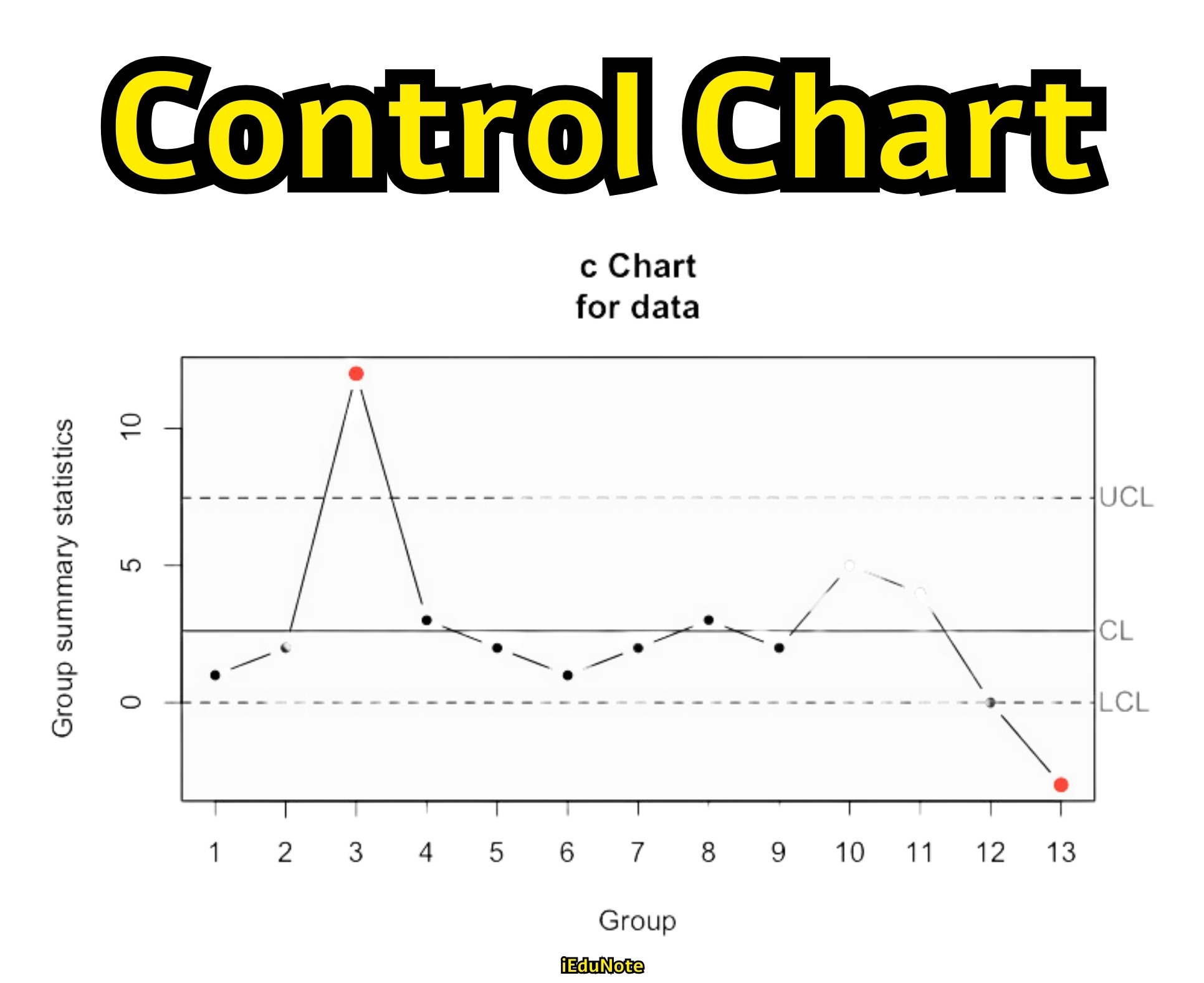
Whether a control chart is constructed based on attributes or variables, in each case, a particular quality characteristic is measured and then examined.
Variables are those quality characteristics of a product for which numerical values can be obtained, such as average length, average resistance, average service time, etc.
Attributes are such quality characteristics as the proportion of nonconforming items, the number of nonconformities in a unit, and the number of defects per unit. Control charts can be used to evaluate the past records related to a process to see whether the process has been in statistical control.
They can also be used to evaluate the present status of a process to maintain a state of statistical control during the operation of the process. By using control charts, we can get a real-time signal, and based on this, we can maintain an existing state of process stability.
Control charts can further be used to predict the future condition of a process based on the collected data plotted on the charts.
When managers use control charts for quality control, they benefit in several ways:
- Managers can understand when something is wrong, and accordingly, they can take corrective action.
- The chart helps in identifying the causes of problems, and managers can determine the appropriate type of remedial actions necessary for the solution of the problems.
- When the chart shows that the process is normal in terms of variability, managers can decide to leave the process alone with no corrective action.
- Managers can estimate the process capability when the chart shows that the process is in statistical control. Knowledge about process capability is helpful in designing products and processes.
- Managers can have useful information from the control chart that they can use for quality improvement.
Pareto Diagram
“A large percentage of the results is caused by a small percentage of the causes” — is the essence of Pareto analysis. It teaches us that since a few small but vital problems cause big results, concentration on those problems would bring greater success.
The Pareto Diagram owes its origin to Alfredo Pareto, an Italian economist. His studies of the distribution of wealth in Europe between 1848 and 1923 revealed that wealth was concentrated in a few people – “there were a few people with a lot of money and many people with little money.”
The findings of Alfred Pareto imbued him to formulate the ‘Pareto principle,’ which postulates that the majority of wealth is held by a disproportionately small segment of the population.
Joseph Juran, one of the coveted TQM Gurus, felt that the Pareto principle could be applied universally to many fields, including quality improvement. Juran was of the view that ‘defect types’ or problem areas in any organization – manufacturing or service – could follow a similar distribution pattern.
Not all but a few of all the problems frequently occur. These are known as ‘vital few,’ and the others that seldom occur are labeled as ‘trivial many.’ The Pareto principle is also consistent with the 80/20 rule. The rule states that “80% of the problems/defects are created by 20% of the causes.”
Based on this rule, the Pareto diagrams are used to identify the most critical attention by management.
Thus, management can quickly pick up the major problems, undertake appropriate measures to resolve the problems, and thereby contribute effectively and efficiently towards improving the quality of products or services.
The problems (nonconformities or defects) are arranged, in Pareto diagrams, in descending order (or order of importance). In a graph form, the data classifications (for example, complaints, problems, causes, types of nonconformities) are arranged from left to right on the horizontal axis.
The problems (or the data classifications) labeled as vital few are placed on the left and the trivial many on the right.
The vertical axis represents the frequency or monetary denomination. The data presented this way creates a visual impact and provides a graphical view of those important problems that deserve careful attention.
Thus, Pareto diagrams help management in pursuing Management by Exception (MBE).
Also, management can allocate scarce resources to solving the specifically identified critical problems.
Since Pareto diagrams can be used for problem identification and measurement of progress, they are considered as powerful quality improvement tools.
Moreover, they can help crystallize thinking on priorities – that is, eliminating which problem will give the most benefit.
Steps Involved in Constructing Pareto Diagram
Step 1: Decide on the method of classifying data.
This step involves the determination of the data system. Data may be classified on several bases such as problem type, nonconformity type, causes type, and so forth.
Step 2: Determine the basis for ranking the characteristics.
It may be in terms of monetary values or frequency of occurrence or both.
Step 3: Collect data.
Data need to be collected for an appropriate time interval. Alternatively, historical data may be used.
Step 4: Rank the categories of data.
The ranking should preferably be from most important to least important (or largest to smallest).
Step 5: Compute the cumulative frequency of the data categories in their chosen order.
Step 6: Construct the diagram.
The last step involves plotting a bar graph, which shows the relative importance of each problem area in descending order. The next thing to do at this stage is to identify the ‘vital few’ so that management can take immediate action to improve quality.
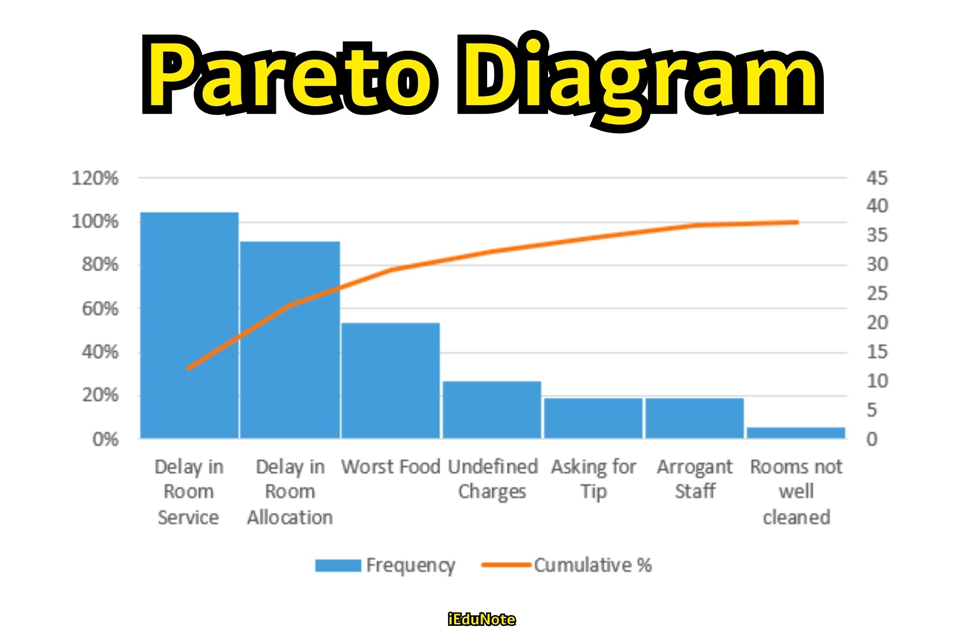
An Example of Pareto Diagram
Data is gathered regarding the types of non-conformance in a textile mill. The table below lists the problem areas, along with the percentage of occurrence of each and the associated annual cost. Management wants to focus on the problems that represent at least 80% of the occurrences.
The four most significant problem areas are subpar quality of cotton, improper tension setting, inadequate operator training, and bale storage problems; they are responsible for 84% of the non conformities.
Together, they are costing the company $31,000 annually; this implies that eliminating them would result in a savings of the same amount.
The table below also shows the cumulative percentages of occurrence for the different problem areas. A Pareto diagram, constructed with the data from table below , is shown in figure above. Management should definitely address the issue of subpar quality of cotton (problem type A) first.
Eliminating this problem will result in savings of about $20,000, more than for any other problem listed. Pareto diagrams can help crystallize thinking on priorities—that is, eliminating which problem will give the most benefit (in this case, cost savings).
Pareto diagrams are also used to compare process conditions (in terms of either the problem causes or the nonconformities) before and after action is taken to improve the process.
For instance, after a thorough investigation of the problem areas of example in the table below, management would move to take remedial action. They might thereafter wish to determine whether there really is a reduction in nonconforming product.
| Problem Type | Description | Percentage of Occurrence | Annual Cost (in $1000) | Cumulative % of Occurrence |
|---|---|---|---|---|
| A | Subpar quality of cotton | 40 | 20 | 40 |
| B | Improper tension setting | 20 | 6 | 60 |
| C | Inadequate operator training | 14 | 3 | 74 |
| D | Bale Storage problem | 10 | 2 | 84 |
| E | Drop in hydraulic pressure in press | 8 | 2 | 92 |
| F | Cutter not sharp | 5 | 1.5 | 97 |
| G | Dye for use in color not adequate | 3 | 1.8 | 100 |
The benefits of the Pareto diagram are easily discernible. Obviously, quality improvement of the vital few has resulted in greater benefits than improvement of the trivial few.
For example, if problem categories A and B have been eliminated, it will lead to savings of $26,000 (for A alone, savings are $20,000), which are much greater than similar proportional improvement of other problem categories.
Also, obvious is the fact that once the first important problem is solved, then comes the turn of the next problem, and the process continues until the concerned problem appears to be not a serious threat to quality. Thus, the Pareto diagram takes the form of a never-ending process.
Run Chart
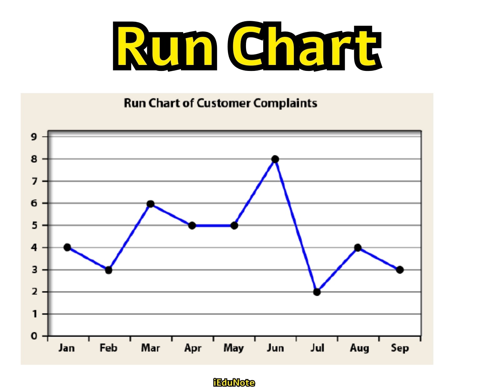
A Run chart is prepared to show the plotting of quality-related data as a function of time. Data are plotted cpoint-by-point in the order in which they are obtained’.
A Run chart thus depicts the general trend and degree of variability in the process. We can have some notion about the process operating conditions. Thus, Run Charts provide some insight into the production/ service process.
Fishbone Diagram/Ishikawa Diagram
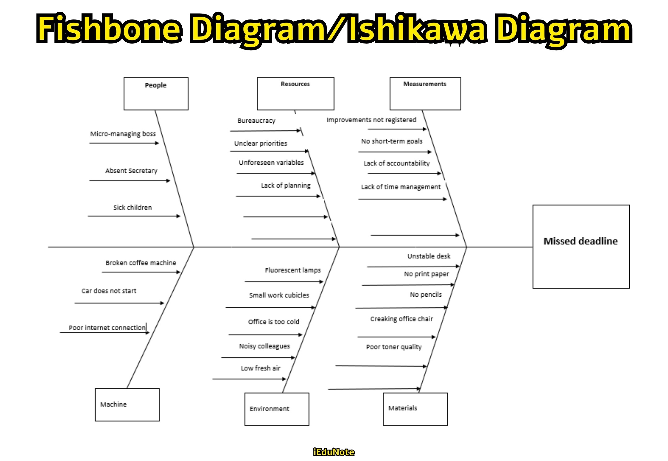
Developed by Kaoru Ishikawa, a Japanese quality expert, in 1943, Fishbone diagrams help identify different causes related to a problem or effect. They establish a relationship between an effect and its cause. That’s why they are also popularly known as Cause-and-Effect Diagrams.
From the causes identified, management can determine those causes which have the greatest effect. Management can also identify the reasons for a process going out of control. Fishbone diagrams (cause-and-effect diagrams) are useful to:
- Analyze actual conditions for the purpose of product or service quality improvement, more efficient use of resources, and reduced costs.
- Eliminate conditions causing nonconformities and customer complaints.
- Standardize existing and proposed operations.
- Educate and train personnel in decision-making and corrective-action activities.
Steps in the Construction of a Fishbone Diagram:
Step 1: Select an ‘effect’ which should be investigated for identification of the ’causes’. A quality characteristic, for example, maybe an effect.
Step 2: Identify the causes in relation to the effect (or quality problem).
Major causes are first identified, and then the sub-causes (minor causes) to every major cause are determined.
For example, a major cause of an effect is the ‘operator.’ The minor causes for the operator may be education, experience, training, and skill. The minor causes are difficult to identify. That is why team members frequently organize brainstorming sessions.
All members participate and generate ideas in a freewheeling exchange of information. All team members get the opportunity to use their creative thinking capacity.
Step 3: Use a piece of paper and place the ‘effect’ on the right side of the paper.
Then, place the major causes, along with the minor causes, on the left side of the diagram.
After completion of the diagram, evaluate it usually in a team member session to identify the most likely causes.
Once the causes are determined, the next task is to develop appropriate solutions/interventions. The interventions are put into place to eliminate the causes and improve the process.
Check Sheet

Quality-related product/ service characteristics are recorded in checklists. Product characteristics are likely to vary depending on the nature of the product. Some examples are length, width, weight, height, diameter, smoothness etc.
The major purpose of using check sheets is to enable users to collect and organize data in a systematic way so that data processing and analysis become efficient. The data contained in a check sheet can be used for constructing various types of control charts, histograms, and Pareto diagrams.
Different types of data in an organization can be collected using check sheets, such as information about processes, products, costs, customers, employees, paperwork, sales, personnel, administrative affairs, suppliers, etc. It may be noted that invisible data cannot be studied using check sheets.
Invisible data includes such data as the cost of an unhappy customer. Check sheets may be of many types. However, three types are especially important in manufacturing organizations:
Defect Attribute Check Sheet
The attribute Check Sheet shows the data on defects in a process can be collected to determine the number of defects generated by each cause so that appropriate action can be taken to improve the process).
Defect Location Check Sheet
Variable Check Sheet shows the data can be gathered on variables such as size, weight, diameter, etc., and then organized in a frequency distribution).
Defect Location Check Sheet
Defect Location Check Sheet helps an an inspector indicates the location and nature of defects on the picture of a product, such as the picture tube of a TV set. If most tubes have spots on the right-hand corner, further analysis can be performed to find causes, and thereafter, we can implement a plan to eliminate the problem.
Histogram (Frequency Distribution)
In the form of a vertical chart, a histogram portrays the variability of data over a period of time and helps identify changes in a process.
For the preparation of a histogram (also called ‘frequency distribution’), we need to gather data related to a particular process and allocate the data into a small number of classes. Then, after sorting the data, we have to plot the histogram.
While plotting, we first draw vertical bars. Each bar has a width corresponding to the width of the class interval. Similarly, each bar has a height corresponding to the frequency of the interval.
All the bars have common sides. No space exists between the bars. After completion of plotting the data in the histogram, we can extrapolate a more or less artistic curve.
Histograms are used in organizations to achieve several objectives :
- To monitor a process in order to examine the consistency in meeting customer requirements;
- To show how data are dispersed helps in understanding the extent to which a process is operating normally, that is, whether the process is under control and
- To suggest ways of keeping a process in control. If the quality control personnel can detect deviation from a normal distribution, they can locate the root causes of the problems.
Flowchart
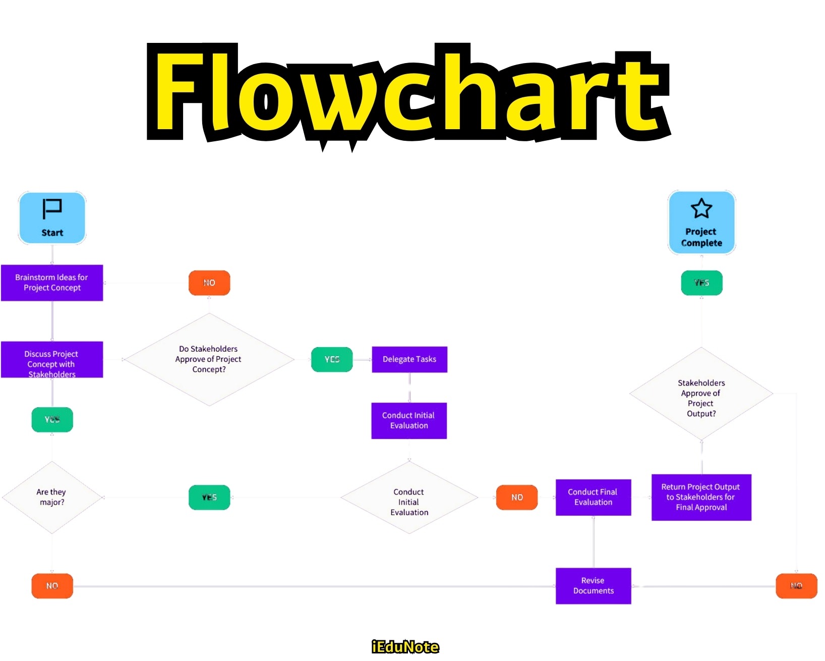
A process (production process or service process) comprises several flows and decisions. These flows and decisions can be shown in the form of a flowchart, which is actually a pictorial summary of flows and decisions in the process.
Flowcharts are used to define and document the process. A flowchart can provide essential information about a process.
Managers, analysts, or any other person can use this information for analyzing and improving the process. All types of organizations can use flowcharts to define and document a process with the ultimate objective of improving it.
Flowcharts can benefit an organization in many ways.
- As a communication tool, it provides an easy way to convey ideas among engineers, managers, hourly personnel, vendors, and others in the extended process.
- As a planning tool, it enables process designers to visualize the elements of new or modified processes in the planning stage.
- It provides an overview of the critical elements and steps of the process. Thus, the process designers and others get a clear look at what they are creating.
- It demonstrates the roles of personnel, workstations, and subprocesses in a system and shows the personnel, operations, and locations involved in the process.
- It shows the relationship of the elements in the process.
- It enables the persons concerned to easily spot errors in logic.
- It facilitates troubleshooting as a diagnostic tool. Flowcharts help in detecting problems in the process, failures in the system, and barriers to communication.
- It provides written documentation of a system.
Flowcharts may be process flowcharts or decision-path flowcharts. A process flowchart (also known as a system flowchart) is constructed to show the tasks that normally follow a single path. This chart shows what is being done in the process.
A decision-path flowchart shows tasks that follow multiple paths. Symbols, already stated earlier, are used in constructing decision-path flowcharts.
How Continuous Improvement Is Practiced?
An appropriate organizational culture is the most important ingredient for continuous improvement. If everyone in the organization understands and believes in the importance of continuous improvement, the second question is about technique. If the right culture is not present, the technique will not work.
There are a large number of possible areas in an organization that could be improved. Setting priorities is crucial, and there are several ways to do this.
Many organizations rely on customer input and feedback to help set their priorities.
For example, if late deliveries are the most common customer complaint, continuous improvement efforts should be directed at reducing delivery times.
The time-honored tradition of the suggestion system has taken on a new life under TQ.
At Portman Equipment Company, an employee who sees an improvement opportunity fills out a Proposal for Change form, which initiates the formation of a team to tackle the issue.
At AT&T Universal Card Services, employees contribute an average of 4.6 suggestions per year, half of which are implemented. This rate of suggestions is still dwarfed by the number of suggestions contributed in some Japanese firms.
The Plan-Do-Study-Act (PDSA) cycle provides the basic process for continuous improvement. An operation is examined to identify potential areas for improvement.
Techniques such as check sheets and Pareto charts are used to prioritize problems.
Then, steps are taken to improve the operation, and the results of the change are studied. This leads to further action, and the cycle continues for the foreseeable future.
This is somewhat similar to the familiar problem-solving model of which steps are stated below:
- Specifying the problem
- Identifying causes of the problem and determining which are most serious
- Developing a list of potential solutions
- Analyzing the potential benefits of the solutions and choosing the best one
- Implementing the solution.
An important difference is that with a continuous improvement mindset, step 5 leads directly back to step 1 unless the operation is now faultless.
Continuous improvement efforts can be directed to a number of different types of improvement.
For example, changes could result in work being done more easily, more accurately, faster, at lower cost, more safely, and in a way that provides greater customer satisfaction.
Thinking about continuous improvement in this way makes it clear how many opportunities for improvement exist in almost every system.
Persistence is important in pursuing continuous improvement. According to the late Japanese manufacturing expert Shigeo Shingo:
“Since improvement demands new procedures, a certain amount of difficulty will be encountered. Initially, new methods will be difficult. Old procedures, however, are easy just because they are familiar. As long as it is unfamiliar, even an improved procedure will be more difficult and will take more time than the old procedure. Thus, no improvement shows its true worth right away … 99 percent of all improvement plans would vanish without a trace if they were to be abandoned after only a brief trial.”
Continuous improvement is difficult to sustain, like cultural change.
In any case, many organizations that wish to embrace continuous improvement have not been able to do so successfully, as indicated by the findings of a survey of American manufacturing firms by the National Center for Manufacturing Science (NCMS):
Japan, Germany, and other industrialized nations recognize the continuous improvement process as crucial to world-class manufacturing.
However, industrial leaders responding to the NCMS survey admit that they have a spotty track record in this area.
For example, half of those responding said that they have no continuous improvement plan in place, and nearly 40 percent of the respondents also indicated that suggestions from continuous improvement team members were not regularly implemented.
Continuous Improvement and Baldrige Award
Continuous improvement is a core concept in the Malcolm Baldrige National Quality Award criteria. The guidelines state:
Achieving the highest levels of quality and competitiveness requires a well-defined and well-executed approach to continuous improvement. The term continuous improvement refers to both incremental and “breakthrough” improvement. A focus on improvement needs to be part of all operations and all work unit activities of a company. Improvements may be of several types:
- Enhancing value to customers
- Reducing errors, defects, and waste
- Improving responsiveness
- Increasing productivity
- Enhancing the company’s performance and leadership position in fulfilling its public responsibilities.
The Baldrige Award seeks evidence of evaluation and improvement cycles in nearly every category of the criteria. The award itself sets an example by continually improving the nature of the award criteria and the application process each year.
Continuous Improvement in the Eye of Islam
Continuous improvement is essential in Islam. The teaching of Islam is that Allah has created us. After creation, our physical structure is continually being developed, and so is our brain.
Our education and learning help us to improve our morality continuously. Our behavior is developed continuously because of our learning and knowledge.
It is unnecessary for Allah to improve His creation process continuously because all of the best qualities belong to Him, and whatever He created, He prescribed the best way of doing it. As Allah says, “We have created you (human being) in the best way.”
It is our responsibility to try again and again to develop our activities until we die. It is the obligation for every good Muslim to repeatedly try to develop his/her daily activities.
As narrated by Hazrat Ali ®, “If your today’s activities are not better than those of yesterday’s, you are not a good Muslim.”
These activities include not only our personal activities but also the activities through which we serve others. It is human nature to want better quality products and better behavior from others, and this demand is increasing day by day. Prophet Muhammad (SAW) said, “Do for others whatever you want from others.”
This Hadith teaches us to improve the quality of our deeds continually, and definitely, it’s an ibadah for a Muslim.
Conclusion
Continuous improvement relies on tools like benchmarking, control charts, Pareto diagrams, run charts, fishbone diagrams, check sheets, histograms, and flow charts. These tools facilitate process comparison, trend analysis, root cause identification, and data organization, driving quality, efficiency, and customer satisfaction enhancements through structured improvement initiatives.